Georgs Bio-Bauern
Pesto Label Redesign
the context
the client
Georg Thalhammer's company specializes in organic agriculture, focusing on the cultivation and distribution of high-quality organic vegetables, particularly pumpkins and pumpkin-based products. Alongside their fresh produce, they offer a range of premium fine-food goods — including pestos, purees, spreads and oils — all crafted with a commitment to quality, regionality and environmental responsibility.
visit product rangethe brief
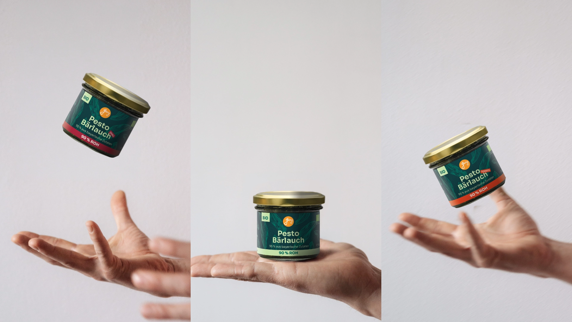
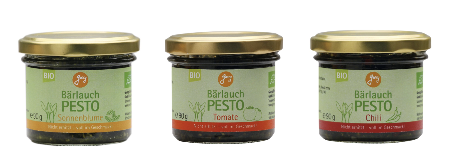
The immediate focus was a rebranding of the small, regional Pesto line — three varieties: Bärlauch (Wild Garlic), Bärlauch–Tomate, and Bärlauch–Chili.
Beyond the pesto line, the client's broader vision is to eventually unify the entire product range under a single, cohesive brand design to strengthen recognition on the shelf. To lay the groundwork for that, two initial concepts were developed in parallel around the two flagship products: Pesto and Kürbispüree.
my role
As graphic designer, I was responsible for the label concept and design for the Pesto and Kürbis line.
• label design
• illustration
• concept development
the approach
what makes the product special
Two USPs shaped the direction from the start:
• Unpasteurized and fresh: unlike most competitors in the dry-goods aisle, these pestos are made from fresh herbs and never pasteurized, a rare position for a shelf-stable product usually only found refrigerated with a short shelf life.
• Highly regional: up to 95% regional or German ingredients, including regional sunflower seeds and oil.
Together with the premium, small-batch nature of the product, this called for a label that communicated craft and freshness — not a typical mass-market pesto jar.
information hierarchy
Working from the client's product facts, I structured what needed to be communicated at a glance versus on second read. Front-of-label priorities:
• Intense, raw flavour — not pasteurized, cold-filled
• Organic, hand-harvested wild garlic from German forests
• 95% regional (Bavarian) ingredients
• Vegan, just 5 ingredients, no fillers or additives
• Cold-pressed oils
Usage suggestions (cooking, baking, spreads, dips) were deprioritized to the back of the label.
Design requirements
The client's direction was clear on tone and constraints:
• Vibe: organic but noble, young but not overly playful
• Visual clarity: a cleaner design, significantly reducing the small decorative graphics used on the current packaging
• Color: distinct, clear colors to differentiate the three varieties, with accents: avoiding both "too white" and "too black" aesthetics
• Logo: exploring a shift away from the current orange "Georg" wordmark toward the script lettering alone
• Format: possibility of a smaller, cut-out label that reveals more of the product itself, reinforcing freshness and quality
• Material: no transparent plastic labels — a custom label shape instead
the solution
the concept
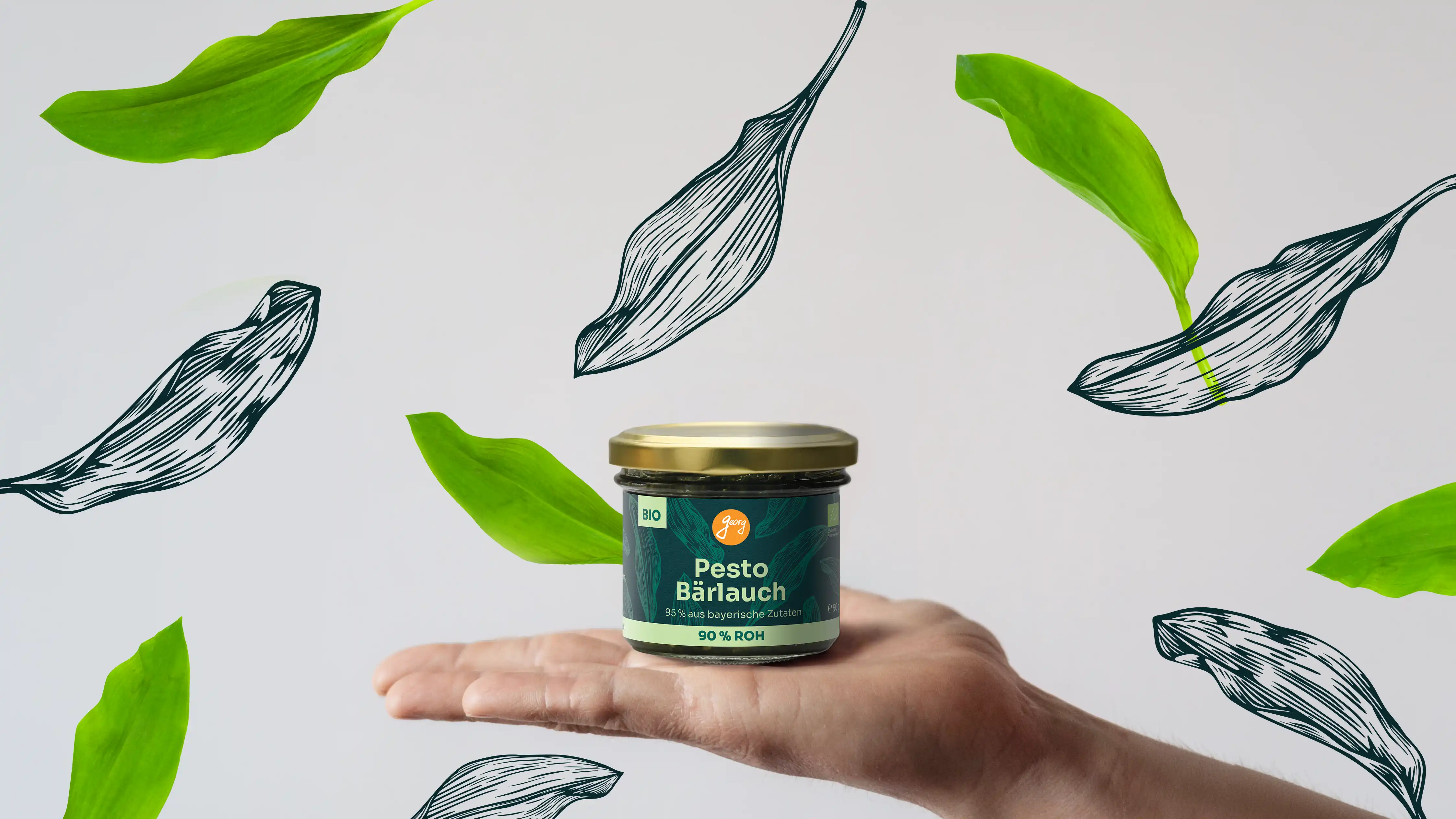
To reflect the product's craft and premium positioning, I explored a woodcut / linocut illustration style for the wild garlic motifm a technique that carries a handmade, artisanal quality in line with the product's small-batch, regional story. These illustrations are scattered irregularly across the label rather than arranged in a rigid pattern, echoing the organic, foraged nature of the ingredient itself.
before
after